
Why Responsive web design is important in modern web pages
By Antony Varghese
-
Tech
-
March 31, 2025
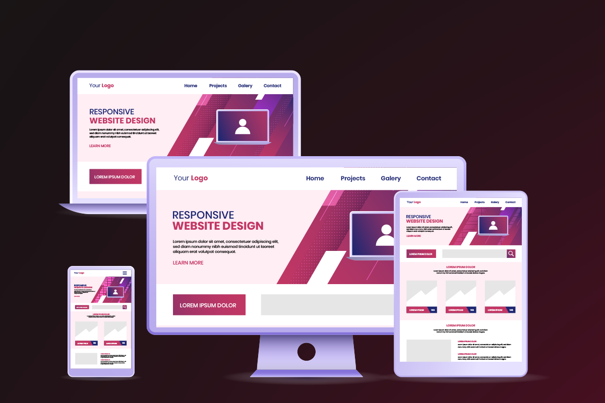
Responsive web design (RWD) is extremely important because it ensures that websites provide a seamless and optimal user experience across a wide range of devices and screen sizes. Here are a few key reasons why it’s essential:
1. Improved User Experience
-
Consistency Across Devices: With the variety of devices people use today, from smartphones and tablets to desktops and smart TVs, responsive design ensures that your website adapts to any screen size. This creates a smooth and consistent experience for users, no matter how they access the site.
-
Better Navigation: A responsive design automatically adjusts the layout, navigation, and content to make it easy to use, even on smaller screens, without the need for zooming or horizontal scrolling.
2. Mobile-First Approach
-
Growing Mobile Traffic: More people are browsing the web on mobile devices than ever before. Responsive design helps cater to this trend by ensuring that your site is optimized for mobile devices. In fact, Google prioritizes mobile-friendly websites in its search results.
-
User Expectations: Today, users expect websites to work well on mobile devices. If your site isn’t optimized for smartphones and tablets, users might leave and go to a competitor’s website that offers a better mobile experience.
3. SEO Benefits
-
Single URL for All Devices: Rather than having separate URLs for the desktop and mobile versions of your site, responsive design uses a single URL. This helps consolidate SEO efforts and improves search engine rankings because search engines like Google prefer single URLs.
-
Faster Loading Times: Responsive websites are typically optimized for performance across devices, which can result in faster loading times. Page speed is a ranking factor for SEO, so a faster website can improve your search engine rankings.
4. Cost-Effectiveness
-
One Website for All Devices: Instead of creating multiple versions of a website (e.g., one for mobile, one for desktop), responsive design allows you to maintain one website that works across all platforms. This reduces the cost of development and maintenance.
-
Easier Maintenance: With one responsive site, you don’t have to worry about updating multiple versions of your website. It simplifies content management and ensures consistency across devices.
5. Better Conversion Rates
-
Optimized for Users: A responsive design ensures that visitors, no matter what device they use, can easily navigate your site, find what they’re looking for, and take action (like purchasing, signing up, etc.). This leads to better conversion rates, whether you’re selling products or generating leads.
-
Improved Accessibility: A mobile-friendly, responsive design often incorporates better accessibility features, such as touch-friendly elements and larger clickable areas, which improves the overall experience for all users, including those with disabilities.
6. Faster Development and Future-Proofing
-
Adaptability to New Devices: As new devices are released with varying screen sizes, a responsive website is automatically more adaptable to those changes. You don’t need to overhaul the design for every new device or screen resolution.
-
Long-Term Investment: By building a responsive website, you’re ensuring that your site will continue to be effective and accessible as technology and user habits evolve over time.
7. Competitive Advantage
-
Staying Ahead of the Curve: Websites that don’t adapt to mobile-first and responsive design risk falling behind competitors that are more optimized for different devices and screen sizes. A responsive site can help you maintain a competitive edge in the market.
In Summary:
Responsive web design ensures that your website provides an optimal, user-friendly experience no matter the device or screen size. It boosts SEO, improves user satisfaction, enhances conversions, and ultimately helps businesses stay relevant in an increasingly mobile-first world.
Are you working on a site or project that could benefit from responsive design? I’d be happy to dive deeper into how to implement it effectively!
