The Unrealistic Expectation of Pixel Perfection
By Antony Varghese
-
Tech
-
April 1, 2025
Pixel perfection is not exactly a myth, but it’s often considered an unrealistic or impractical goal in many contexts, especially when it comes to design or development for multiple devices and screen resolutions. The term refers to the idea of achieving an image or layout where every pixel aligns perfectly as intended, without any discrepancies.
While pixel perfection is certainly achievable in controlled environments, it can be difficult to maintain in the real world due to several factors:
-
Different Screen Sizes and Resolutions: Devices like smartphones, tablets, and desktops have varying screen sizes and pixel densities. An image or layout that appears pixel-perfect on one device might look misaligned or blurry on another.
-
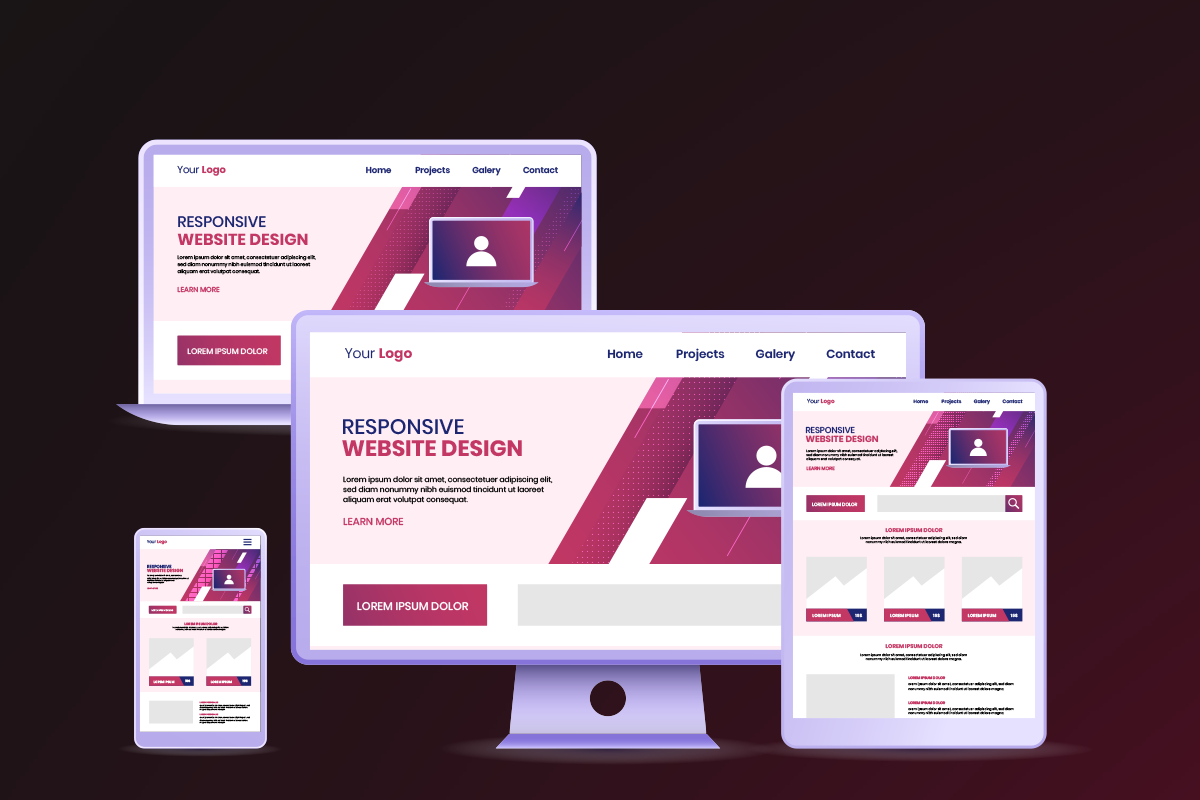
Responsive Design: Websites and applications today need to adapt to a wide range of screen sizes, orientations, and resolutions. A design that’s perfectly aligned on a desktop might not translate well to mobile devices without adjustments.
-
Browser Rendering Differences: Browsers can render elements slightly differently due to variations in how they interpret CSS, HTML, and other code. Even with similar devices, you might notice minor variations.
-
Human Perception: Often, small imperfections that might be considered “imperfections” aren’t noticeable to most users. The human eye can only perceive pixel-level differences in certain circumstances, especially when the display is large or the resolution is particularly high.
So, while it’s possible to achieve pixel-perfect designs in certain controlled conditions (like designing for a specific resolution or device), in most real-world applications, aiming for “perfection” can lead to diminishing returns. Many designers and developers prefer focusing on creating “visually consistent” or “functionally perfect” experiences across a range of devices rather than obsessing over every single pixel.